
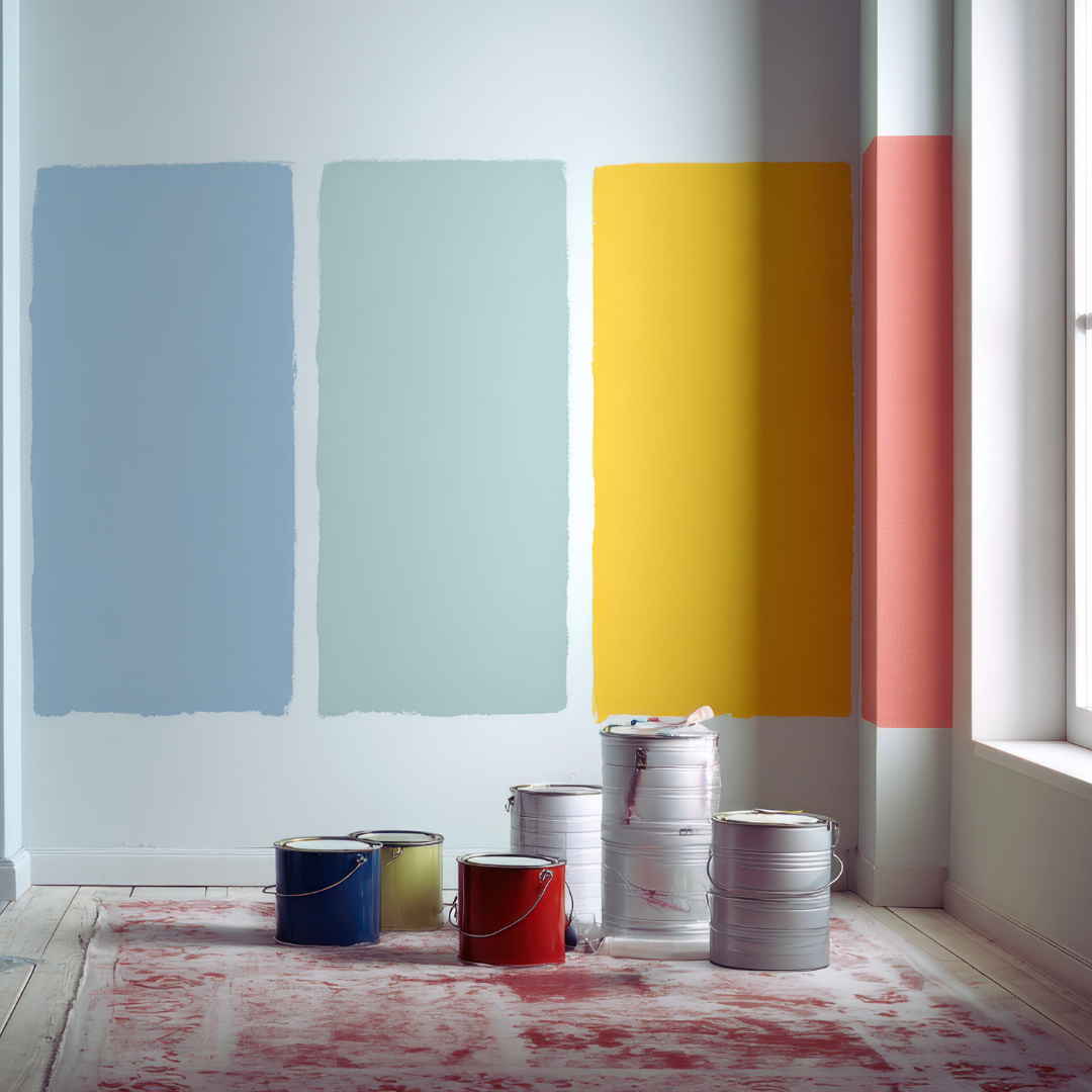
The Best Modern Colour Palettes for Small Homes: Enhancing Space and Style
Choosing the right colour palette can transform a small home, making it feel larger, brighter, and more inviting. Contemporary palettes that incorporate light tones with strategic pops of colour help optimise space without overwhelming it.
The best modern colour palettes for small homes typically combine soft neutrals, muted pastels, and minimal contrasting accents to create an open and harmonious feel. These colours reflect natural light and add subtle depth, enhancing the perception of space without cluttering the visual flow.
Beyond selecting colours, understanding how they interact with lighting and furnishings is key to a cohesive design. This guide explores practical palettes that balance aesthetics and function for small living areas.
Key Modern Colour Palettes for Small Homes
Choosing the right colours can enhance the perception of space and atmosphere in small homes. Effective palettes balance light and contrast to maximise openness while adding depth and character.
Neutral and Warm Tones
Neutral colours such as beige, cream, taupe, and light grey create a calming, spacious feel. These hues reflect natural light, making rooms appear larger and airier. Warm neutrals add subtle warmth without overwhelming small spaces.
Using a mix of warm neutrals in furniture, walls, and soft furnishings creates cohesion. Beige and taupe provide a stable base, while cream highlights architectural details. Light grey offers contrast but retains softness, preventing harshness.
This palette suits open-plan areas where continuity between rooms helps maintain flow. It works well with wooden accents or soft textures, bringing comfort without clutter.
Soft Pastels and Serene Shades
Soft pastels like lavender and sage green introduce gentle colour without reducing brightness. These tones add personality while maintaining the sense of calm necessary for small spaces.
Sage and moss green evoke a natural, restful environment, perfect for bedrooms and living rooms. Soft lavender brings freshness, especially when paired with neutral walls or white ceilings.
Pastel palettes suit minimalist or Scandinavian-inspired interiors. They pair well with light wood and simple décor, offering subtle contrast without visual heaviness.
Bold Jewel and Earthy Accents
Bold jewel tones, including emerald green, create focal points that add richness without shrinking space if used sparingly. Emerald green works well on feature walls or accent pieces to introduce depth.
Earthy colours like terracotta and rust provide warmth and a grounded feel. They complement natural materials and enhance cosy nooks or dining areas.
When applying these strong colours, balance is key. Use neutral backgrounds to avoid overcrowding the palette. Accent cushions, rugs, or art in these tones energise a small home without causing visual clutter.
Strategic Colour Combinations for Small Spaces
Effective colour choices can visually expand small homes and enhance their atmosphere. The use of specific combinations shapes perception, mood, and the sense of space while balancing natural elements.
Using Complementary and Contrasting Colours
Complementary colours sit opposite each other on the colour wheel, such as blue and orange or green and red. Using these pairs in small spaces adds vibrancy without overwhelming. For example, a muted blue wall paired with burnt orange accessories can create energy while maintaining balance.
Contrasting colours increase visual interest and help define areas within cramped rooms. It is important to use one dominant colour and apply its complement as accents. Too much contrast can fragment the space, so aim for subtle uses in furnishings, fabrics, or artwork.
Incorporating colour psychology, cool complementary colours often evoke calmness, ideal for bedrooms, while warm contrasts energise living areas.
Monochrome and Analogous Schemes
Monochrome schemes use variations of the same colour, varying in shade, tint, or tone. This approach simplifies the palette, making a room feel more spacious and cohesive. Soft greys or beiges are common choices for small homes, as they reflect light well and encourage a calm environment.
Analogous schemes involve colours next to each other on the colour wheel, such as blue, teal, and green. These create harmony without monotony and maintain a gentle flow throughout the space. Combining analogous colours with different textures adds depth without complicating the palette.
Both schemes benefit small spaces by minimising visual clutter and fostering a unified look.
Maximising the Impact of Natural Light
Natural light alters how colours appear, making it a crucial factor to consider. Lighter colours reflect more light, helping small rooms feel open and airy. Whites, pale yellows, and soft pastels enhance sunlight, effectively enlarging the space.
Positioning mirrors opposite windows can amplify natural light and extend the reach of colour effects. Darker colours absorb light and can make a room feel smaller, so use them sparingly or in well-lit zones.
Understanding how light quality changes throughout the day can guide the choice of colours that maintain consistency and comfort.
Modern Techniques to Enhance Small Rooms
Small rooms benefit from layered designs that balance light and depth. Using natural and reflective elements can add dimension without overwhelming space. Carefully chosen accents and textures create interest while maintaining a clean, tranquil atmosphere.
Layering and Balance with Neutrals
Neutrals like charcoal, soft greys, and warm beiges form a versatile base. Layering these shades in paint, upholstery, and flooring adds depth and complexity without cluttering a small room.
Light neutrals on walls maximise brightness, while darker tones on furniture or rugs anchor the space. This contrast provides visual balance, making the room feel more spacious yet cosy.
Natural materials such as linen or woven wool in these colours enhance texture. Combining these fabrics with neutral tones creates a calming environment that feels both modern and inviting.
Incorporating Metallics and Stone
Metallic finishes in gold or brass provide subtle sophistication. These can be introduced through fixtures, lighting, or decorative accents to reflect light and enhance spatial perception.
Stone accents, especially those with natural texture like limestone or slate, add an organic edge. They complement neutrals and create focal points that ground a room visually without overpowering it.
Both metallics and stone contribute to a layered effect. Their different reflectivities and surfaces work together to break monotony and keep the space dynamic while maintaining a tranquil atmosphere.
Bringing in Accents and Textured Accessories
Throw pillows and vases in rich textures and colours add personality with minimal space use. For small rooms, accessories in natural fibres or soft finishes provide tactile variety and contrast gently with smoother surfaces.
Choosing accessories in subdued tones or metallics ensures they enhance rather than clutter. Grouping them in small clusters or singular statement pieces maintains clarity and supports balance.
These details are essential to avoid flatness in small rooms. Thoughtful placement of textured accessories injects warmth and dimension, boosting comfort without sacrificing openness.
Current Colour Trends for Small Homes
Recent colour trends focus on creating a sense of space, light, and calm in small homes. Balancing vibrant tones with neutral backdrops helps maximise the feeling of openness. The choices range from popular seasonal shades to timeless colours that avoid quick obsolescence.
Popular Shades for 2025
In 2025, earthy greens like sage and olive dominate small home palettes for their natural, soothing effect. Soft pastel blues and muted terracotta also appear frequently, offering warmth without overwhelming limited spaces.
Bright white remains a staple to reflect light and make rooms feel larger. However, off-white variants with warmer undertones are preferred to avoid starkness. Accent colours in deep navy or gentle mustard add contrast and personality without crowding the visual field.
Embracing Timeless Versus Trending Colours
Small home colour schemes benefit from a blend of enduring and current trends. Timeless hues like warm greys and classic creams provide a versatile foundation that withstands changing tastes.
Trending colours, such as coral or lilac, are best used sparingly as accents or on feature walls. This approach ensures updates remain fresh without requiring full repaints. Homeowners often choose colours that adapt well to different lighting conditions and interior styles.
Leave a Reply